The Secret to Better Titles on Slides and Posters: Semantic Line Breaks
When crafting titles for slides and scientific posters, we often face the challenge of fitting lengthy text into limited space. The natural instinct is to break the title into multiple lines wherever the space runs out or simply let PowerPoint handle the line breaks. While this approach seems convenient, it comes with an overlooked problem: arbitrary line breaks can disrupt the flow of ideas.
When titles are broken mid-thought or between connected phrases, readers must pause and reprocess the information. This minor disruption might not seem significant at first glance, ...
How to Get People to Sit in the Front Row
If you’ve ever given a presentation, you’re probably familiar with the (awkward) sight of an empty front row.
You’ve worked hard to prepare your content, but when your audience arrives, they scatter to the back, and it can feel like you’re speaking to a distant room, which makes engaging with your audience much more challenging.
So, how do you fix this?
There is a simple tactic that can help fill those empty seats up front and create a more engaged audience: get to the auditorium early, and personally invite the 5-10 of the firstcomers to sit in the ...

Streamline Your Scientific Presentations: Always Start on Paper
One common mistake that many scientists make when creating presentations, images, and posters is jumping straight into the software. When faced with the need for a scientific figure, the instinctive reaction is often to open Illustrator or Biorender. Similarly, when preparing a presentation or poster, PowerPoint becomes the immediate go-to tool. Though it might be tempting to start with digital tools, this approach can actually slow you down.
The Problem with Going Digital First
Softwares provide an abundance of options:
50 different line widths and types…
100 ...

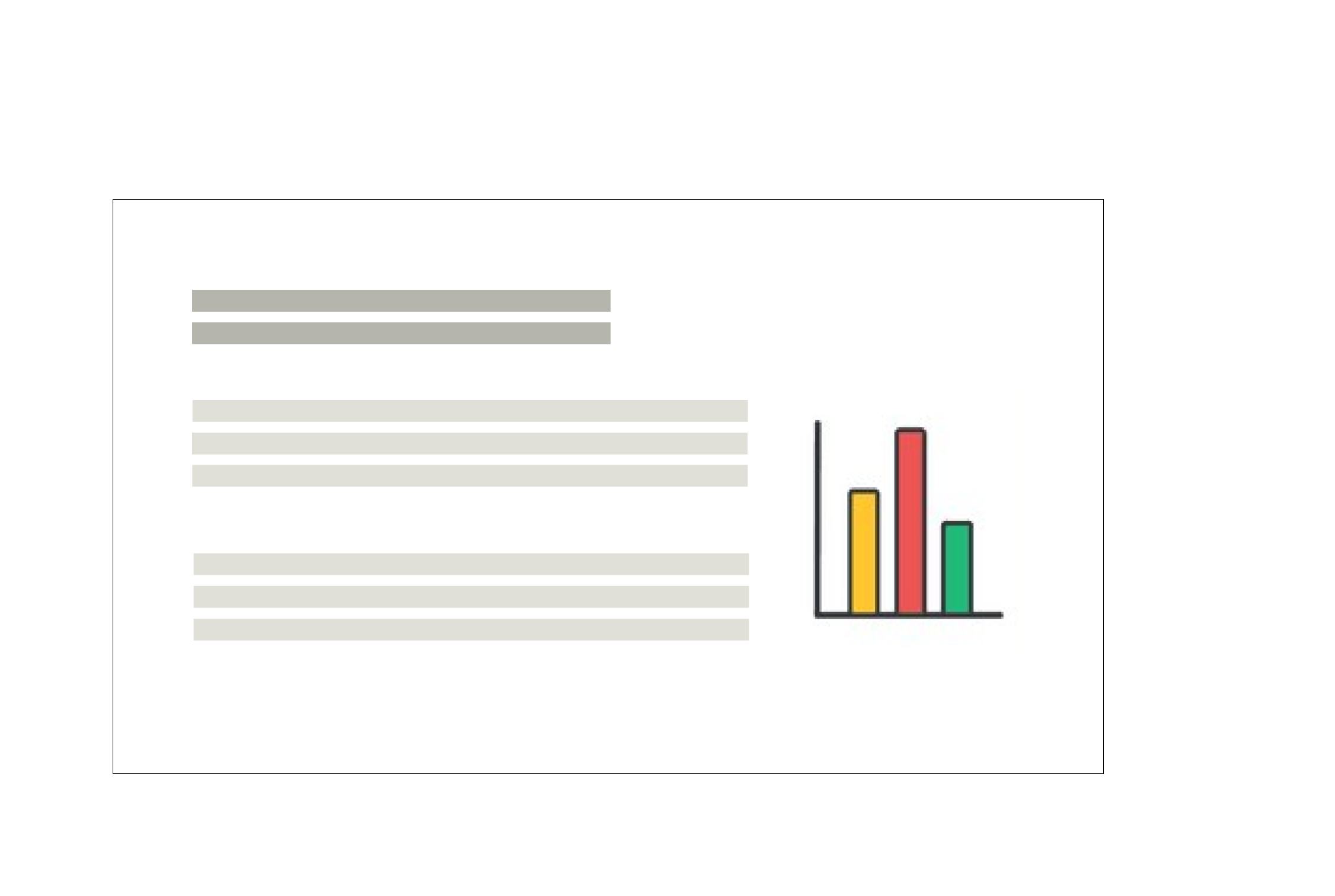
Presenting to Diverse Audiences (scientists or non-scientists)
When giving a presentation to an audience with varying levels of knowledge on your topic, it can be challenging to strike a balance between providing enough detail for the experts and not losing the novice audience. Preparing such talks opens up a taunting dilemma that can increase your anxiety and hinder presentation effectiveness.
This is also one of the questions I often get from my workshop participants (scientist). Fortunately, there are several strategies you can use.
If you are new to your topic and inexperienced in presenting, I suggest you to choose a single ...

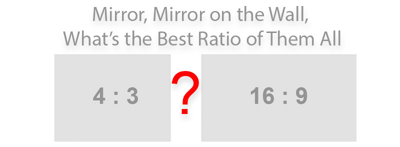
How to Choose a PowerPoint Aspect Ratio: 4:3 or 16:9?
When designing a PowerPoint presentation, one of the first choices one makes is the slide size. PowerPoint has switched to default 16:9 aspect ratio of the presentations a couple of years ago, which follows the trend of "wide-everything", including smartphones, computer monitors, TVs, and projectors & beamers. But with the craze to wide-everything, is 16:9 slide presentation aspect ratio the best choice for all circumstances? Here are my thoughts.
(more…)
Humans Are Visual Creatures
Here we gathered some interesting facts to emphasize why using visual aids in scientific communication is so important.
(more…)

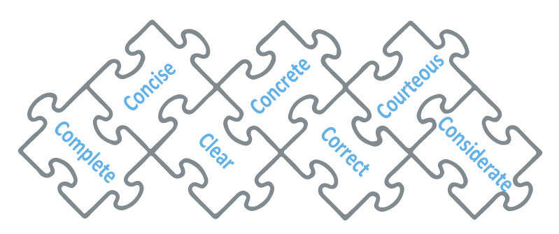
The »7 C’s of Effective Communication« Applied to Science
The concept of »7 C’s of Effective Communication« first appeared in business, where time is precious and there is no room for mistakes done out of misinformation. The »7 C's« stand for seven essential principles of communication starting with the letter C. Each one represents a requirement that the message should meet to be effective. Applying these principles to your communication ensures that your message will be in sync with the recipient's understanding and free from ballast.
(more…)
What is Effective Communication?
Communication, spontaneous and strategic
Communication is all around us. It is the process of exchanging information or ideas between individuals or groups. The purpose of communication is to share information and coordinate actions in order to achieve a common goal or understanding. But what contributes to making the communication effective? Is there any way for us to become more effective communicators?
(more…)

How to Create an Effective Graphical Abstract • Guide
What is a graphical abstract?
A graphical abstract (also called 'visual TOC' or 'TOC figure' or 'visual abstract') is a figure that succinctly visually conveys what your research is about. They have been a part of scientific publications for decades in some research fields (e.g. chemistry) but have only recently penetrated other research fields. As there is not a lot of literature on graphical abstracts, I'll share some of my findings from analyzing thousands of graphical abstracts from different journals.
(more…)