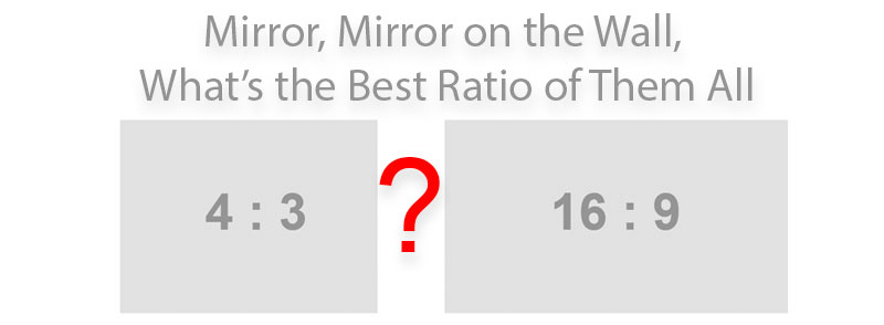
How to Choose a PowerPoint Aspect Ratio: 4:3 or 16:9?
When designing a PowerPoint presentation, one of the first choices one makes is the slide size. PowerPoint has switched to default 16:9 aspect ratio of the presentations a couple of years ago, which follows the trend of “wide-everything”, including smartphones, computer monitors, TVs, and projectors & beamers. But with the craze to wide-everything, is 16:9 slide presentation aspect ratio the best choice for all circumstances? Here are my thoughts.
I do presentations for a living and with close to 300 days of doing PowerPoint presentations in the last decade, here are my thoughts.
- Match the ratio of the projector/beamer. Ahead of your presentation, check the ratio of the projector at the venue and match that.
- Use 4:3 ratio as default. If you can’t get information on the ratio of hardware ahead of the presentation, or if you will be doing many presentations with the same slides, 4:3 ratio is a safe bet.
- Use 16:9 ratio and increase font sizes. If you want to have the 16:9 ratio, but want to be safe for multiple presentations, then increase all font sizes.
Let’s look at the arguments.
1. Match the ratio of the projector/beamer.
For best result, always match the slide aspect ratio to the hardware. Everything will be as intended, the wall/screen area covered will be the largest, which gives the best immersion effect for your audience. Most new projectors have a wide ratio, but check if possible. This is my first recommendation.
2. & 3. Use 4:3 ratio or 16:9 ratio with increased font sizes.
Here, it is important to discuss what happens if there is a mismatch between the aspect ratio of your slides and the one of the projector. There are obviously two situations, both illustrated below.

Your slides are 4:3 and the projector is 16:9
In this situation, your slides are going to fit the projection vertically (in height). Horizontally, there will be a black (invisible) edge on each side. Therefore, all of the sizes in slides will be as planned, nothing is going to be squeezed.
Your slides are 16:9 and the projector is 4:3
Your complete 16:9 slides are going to be visible, however, they will be squeezed to fit the 4:3 screen. There will be a dark (invisible) edges at the top and the bottom (see image above). This means that the text is going to be smaller than it would be on a 4:3 projector.
My experience is from the scientific and educational world of universities and research institutes. Among the projectors I encounter in 2019-2020, approximately 70% are already wide (supporting the 16:9 ratio). For a long time, I just used the 4:3 ratio slides for my presentations, however, as I believe the ‘immersion experience’ is best when the slide and hardware aspect ratios match, I have recently redesigned all my slides. I’ve found that the font sizes have to be approximately 20% larger on the 16:9 ratio slides to accommodate for the situations when my now 16:9 ratio slides encounter an older projector. If I were in an environment, where the hardware was still mostly 4:3, I would have kept with my good old 4:3 slides.
In any case, I don’t find the more vertical space to be an added value. Most presenters put too much content on their slides anyway, and the 4:3 ratio can be a valuable constraint for them 🙂
So how do you approach this dilemma? I’m interested in your thoughts, just put them in the comments below!
-
Trividh Patel, CBAP
July 22, 2021 (7:01 am)
I too have lot of 4:3 presentation and want to convert it to 16:9 but I personally find 4:3 to much more readable (when it is mostly text) while 16:9 much more viewable (when it is mostly videos or pictures).


Lauren
October 19, 2020 (4:36 am)
thank you this is exactly the thought process I needed!